Brand orientation
The LLB Group’s StepUp2020 strategy focuses on the four core elements – growth, profitability, innovation and excellence. It is reflected in the vision and guiding principles of the Group and in the strategic positioning of the two brands, “Liechtensteinische Landesbank” and “Bank Linth”.
Vision
The LLB Group’s vision is: “We set standards for banking with values.” Our vision of banking is based on the idea that we can excel at managing material values if we have a clearly defined system of values.
Guiding principles
The LLB Group’s guiding principles, which are derived from this vision, express four binding values that shape our corporate culture: integrity, respectfulness, excellence and pioneering (see chapter “Strategy and organisation”).
Brand positioning
Both LLB Group brands, “Liechtensteinische Landesbank” and “Bank Linth”, have an identical system of values. At the same time, the brands are clearly positioned with their own promise. For LLB, this is “Tradition meets innovation” and for Bank Linth, “Truly simple”. The respective differentiation of each brand from competing brands provides an important basis for successful brand management.
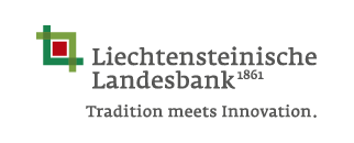
Liechtensteinische Landesbank is the oldest and longest-standing financial institution in Liechtenstein. It is committed to a concept of banking that is geared towards security and stability, while still being target-oriented and dynamic. LLB has innovative power, the strength of which comes from tradition. It creates added value by synthesising competing values. This leads to new and pioneering solutions. As a bank of values, LLB’s journey from tradition into the future is encapsulated in the claim “Tradition meets innovation”.
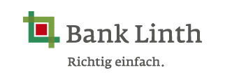
Bank Linth focuses on nurturing strong relationships. As the first financial institution in Switzerland, it has been consistently meeting clients’ needs for years now by practising its motto of being “Truly simple”. The idea behind this is to provide the individual client with time-saving, clarity and convenience in an ever more hectic and complex world. Excellent service quality, clearly and comprehensibly communicated, transforms clients into equal partners. Simplicity here works at three levels:
- Simple access – we want to approach our clients openly and provide a direct route to key contact partners.
- Simple offerings – our offerings and solutions must be intelligent and uncomplicated and correspond to the clients’ individual wishes.
- Simple communication – we speak in a way that is easy to understand and our clients know what to expect from us.
Brand study
Knowing the values our clients hold is the basis of our brand management. Our brand study from 2016 shows the three main characteristics ascribed to LLB:
- LLB is very firmly anchored in Liechtenstein.
- LLB is perceived as an asset management partner.
- LLB is seen as a traditional, secure and stable bank.
The success of the LLB Group is closely related to client satisfaction. We receive information on the effectiveness of our client focus from regular analysis of the systematic feedback from all market divisions.
Brand components
The figurative mark of the LLB Group is classical and modern. The clear geometry of the brand logo stands for security and stability. The angles projecting beyond the basic shape symbolise our openness. The colour green signals our origin, and the red square core stands for our focus on what is essential and on our partners. The harmony and equality with which the elements form a unity represent connection and partnership. All LLB Group brands contain the same brand values.
Brand name
The brand architecture comprises two levels – the figurative mark and the brand name. The latter may deviate if a subsidiary is not fully owned by LLB. Hence Bank Linth bears its original name.